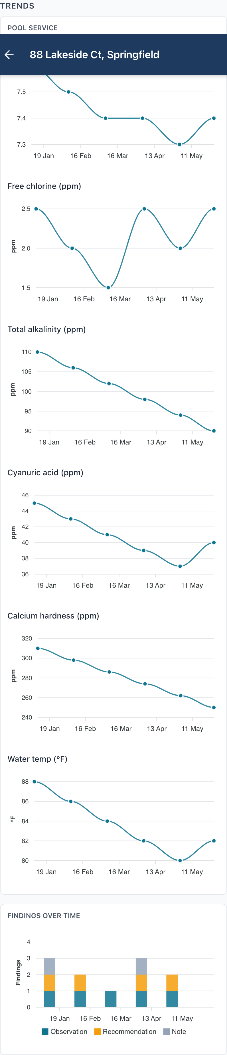
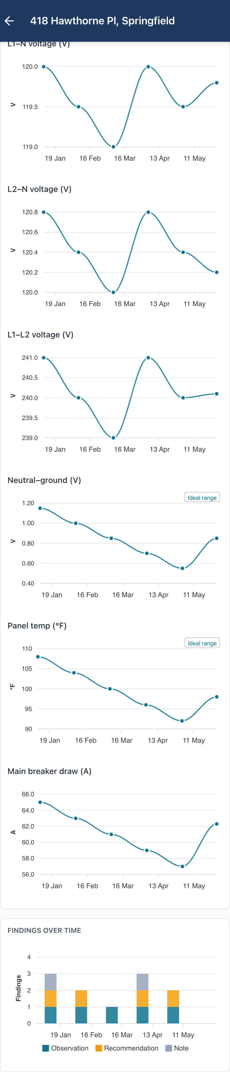
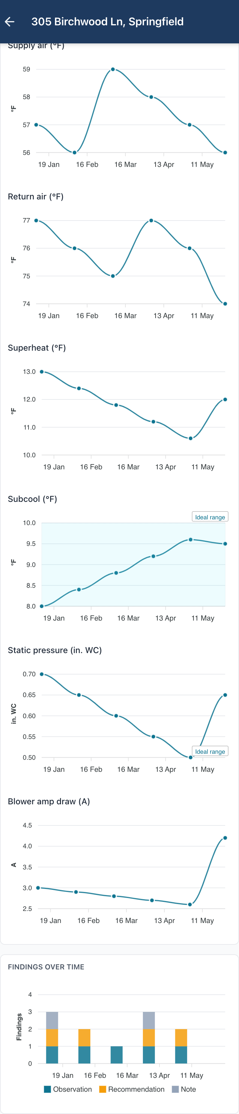
A line chart per measurement
Apex renders a per-measurement line chart for every chartable field in the discipline, with the ideal-range band shaded behind so out-of-range readings stand out.
Every visit, one property record. See the numbers drift before they become problems.
Every inspection belongs to a Site — the property itself. Repeat visits build a per-site history, and Apex charts every numeric measurement and finding category over time, so chemistry drift, superheat creep, or a panel's neutral-ground climb is visible at a glance.
Apex renders a per-measurement line chart for every chartable field in the discipline, with the ideal-range band shaded behind so out-of-range readings stand out.
Findings stack by category in a parallel column chart, so recurring issues at a property are obvious across visits.
The finalized PDF carries the same trend story as a clean appendix — same line charts, same shaded bands. No separate dashboard login for your client.
Sites group repeat inspections so you can see a property's arc across time, not just on the day. Your client gets the day's report and the long arc in one document.
Apex provisions your workspace within one business day and emails your login. The 7-day free trial doesn't start ticking until you're in — no charge until you decide.